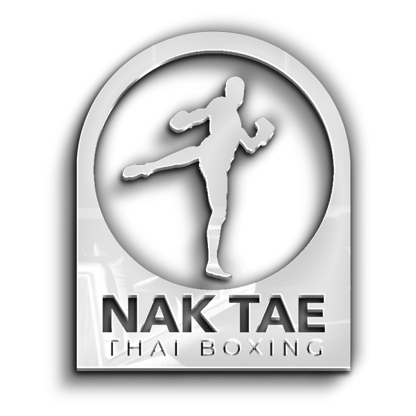
NakTae Belfast: Empowering Martial Arts Spirit through Logo Design by BelfastIT
In the heart of Belfast, a new beacon for Muay Thai enthusiasts has emerged – NakTae Belfast. BelfastIT is thrilled to announce the successful completion of a logo project for this dynamic Muay Thai gym. The new logo serves as a symbol of strength, discipline, and the vibrant spirit that defines NakTae Belfast’s commitment to empowering martial artists on their journey.
Understanding NakTae Belfast:
NakTae Belfast, a premier Muay Thai gym, approached BelfastIT with a vision to create a logo that would mirror the essence of their brand. With a mission to provide top-tier Muay Thai training in a supportive and empowering environment, NakTae Belfast sought a logo that would not only embody the spirit of martial arts but also communicate their dedication to excellence and community within the gym.
Crafting a Symbol of Strength and Unity:
- Embarking on the Muay Thai Journey: The logo design process began with a deep exploration of NakTae Belfast’s ethos and their unique approach to Muay Thai. BelfastIT aimed to create a symbol that not only celebrated the power of martial arts but also conveyed the unity and discipline that defines NakTae Belfast’s training philosophy.
- Dynamic Color Palette Reflecting Martial Energy: Colors were chosen intentionally to evoke the energy, strength, and vibrancy of Muay Thai. A dynamic combination of bold reds and blacks was selected to create a visually striking palette that aligns with NakTae Belfast’s commitment to empowering martial artists and fostering a sense of community.
- Typography Infused with Martial Arts Spirit: Typography played a crucial role in crafting a logo that mirrors NakTae Belfast’s dedication to the art of Muay Thai. The chosen typeface communicates a sense of strength, tradition, and modernity, reinforcing NakTae Belfast’s position as a hub for passionate martial artists.
The Distinctive NakTae Belfast Logo:
The final logo is a visual representation of NakTae Belfast’s commitment to strength, discipline, and unity:
- Dynamic Muay Thai Pose: The logo incorporates a dynamic illustration of a Muay Thai fighter in a powerful stance. This visual element not only represents the physical prowess of martial arts but also signifies the discipline and focus instilled in NakTae Belfast’s training programs.
- Unified Circle Symbolism: The circular framing of the logo signifies unity and community within NakTae Belfast. It represents a collective spirit where martial artists come together to learn, grow, and support each other on their Muay Thai journey.
- Bold and Striking Design Elements: The bold use of red and black, combined with clean lines and bold design elements, creates a logo that is not only visually striking but also reflective of NakTae Belfast’s commitment to excellence in Muay Thai training.
The Impact of the New Logo:
Since the logo’s implementation, NakTae Belfast has experienced an enhanced brand presence and increased engagement from the martial arts community. The logo now serves as a powerful symbol of NakTae Belfast’s dedication to empowering individuals through Muay Thai.
Conclusion:
BelfastIT takes pride in its role as a catalyst for visual transformation, helping businesses like NakTae Belfast define their brand identity. The successful completion of this logo project is a testament to the power of design in creating a visual language that resonates with the target audience.
If you’re ready to elevate your Muay Thai gym’s brand or embark on a journey of visual transformation, BelfastIT is here to bring your vision to life. Contact us today to explore how we can create a dynamic logo that encapsulates the essence of your brand and communicates your commitment to strength, discipline, and community within the martial arts realm.

