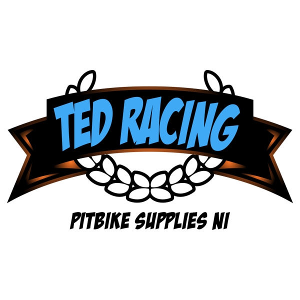
Ted Racing: Unveiling the Revved-Up Logo Revitalized by BelfastIT
BelfastIT proudly introduces the latest triumph in its logo design portfolio – the completion of a project for Ted Racing, a dynamic pitbike selling company. This collaboration resulted in a logo that not only captures the high-octane spirit of pitbike racing but also reflects Ted Racing’s commitment to providing top-notch products for enthusiasts.
Understanding Ted Racing’s Vision:
Ted Racing, a name synonymous with pitbike exhilaration, approached BelfastIT with a distinct vision. They sought a logo that would visually embody the adrenaline-fueled world of pitbike racing while conveying the quality and excitement their products bring to enthusiasts. With a desire to establish a unique visual identity that resonates with their target audience, Ted Racing aimed for a logo that speaks the language of speed, thrill, and quality.
Crafting a Symbol of Speed and Precision:
- In-depth Exploration of Pitbike Culture: The logo design process commenced with a deep dive into Ted Racing’s core values and an exploration of the pitbike culture. BelfastIT sought to understand the excitement, precision, and love for speed that define the pitbike racing community.
- Vibrant and Energetic Color Palette: Colors were carefully selected to evoke the vibrant and energetic nature of pitbike racing. A palette featuring bold reds, dynamic blacks, and racing-inspired yellows was chosen to create a color scheme that signifies speed, energy, and the thrill of the race.
- Typography Reflecting Dynamism: Typography played a pivotal role in crafting a logo that mirrors Ted Racing’s commitment to dynamism. The chosen typeface communicates a sense of motion, modernity, and a passion for racing, reinforcing Ted Racing’s position as enthusiasts dedicated to delivering top-tier pitbike experiences.
The Distinctive Ted Racing Logo:
The final logo is a visual representation of Ted Racing’s commitment to speed, precision, and the exhilaration of pitbike racing:
- Integration of Racing Elements: The logo seamlessly integrates racing elements, symbolizing the heart of Ted Racing’s business. From dynamic racing lines to the silhouette of a pitbike in full throttle, the logo not only speaks to the racing culture but also visually communicates the high-quality products Ted Racing offers to enthusiasts.
- Sleek Lines and Energetic Design: Sleek lines and an energetic design contribute to a logo that not only captures attention but also reflects Ted Racing’s dedication to delivering pitbikes that stand out in the crowd. The logo stands as a visual affirmation of the high-performance nature of Ted Racing’s offerings.
- Excitement and Thrill in Every Detail: The logo serves as an embodiment of excitement and thrill, mirroring the heart-pounding moments experienced in pitbike racing. Every detail, from the dynamic lines to the carefully chosen typography, contributes to an overall design that radiates the passion Ted Racing has for the world of pitbikes.
The Impact of the New Logo:
Since the implementation of the new logo, Ted Racing has experienced heightened brand recognition and a positive response from pitbike enthusiasts. The logo now serves as a powerful symbol of Ted Racing’s commitment to providing top-quality pitbikes that embody the spirit of racing.
Conclusion:
BelfastIT takes pride in its role as a catalyst for brand transformation, helping businesses like Ted Racing visually communicate their essence. The completion of this logo project is a testament to the power of design in creating a visual identity that resonates authentically with the target audience.
If you’re in the racing industry and looking to elevate your brand or embark on a journey of visual transformation, BelfastIT is here to bring your vision to life. Contact us today to explore how we can create a distinctive logo that encapsulates the essence of your brand and communicates your commitment to speed, precision, and the exhilaration of the race.

